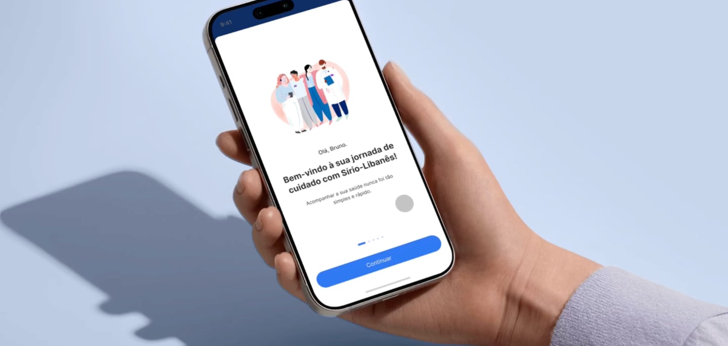
Turning hospital care into a trusted digital journey
Built a mobile hub that reduced front-desk friction and gave patients predictable, self-serve access to care. Delivered measurable impact: 30% less reception waiting time and 1.5M exams available in-app.
Goal
The work aimed to turn the patient experience into a trusted digital hub, reducing operational friction (front desk, paperwork, rework) while increasing predictability and patient autonomy across the care journey.
Problem
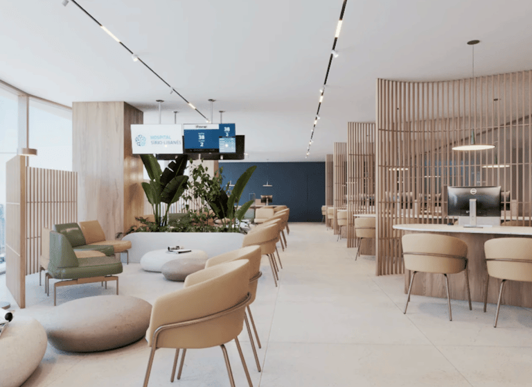
Manual front-desk processes creating high friction at check-in.
Long queues and low predictability, increasing patient anxiety and burdening staff.
Disconnected services (appointments, inpatient experience, documents), forcing patients through multiple steps and channels.
My role
I worked as a Product Designer, contributing to:
prioritizing the highest-impact journeys (volume × pain × operational cost);
defining end-to-end flows and mobile UI with design-system consistency;
aligning stakeholders across operations and product to speed up decisions;
defining metrics and quality criteria (clarity, predictability, reduced effort).
Product timeline
2021 | Product foundation - Reducing uncertainty
The team established the app’s core to reduce front-desk friction and increase predictability:
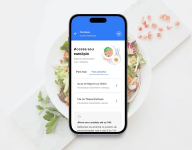
pre check-in to shorten desk time and avoid repeated data entry;
queue status tracking to make progress and next steps transparent;
information architecture and navigation patterns to lower cognitive load.
2021–2022 | Value expansion (autonomy and continuity)
The team expanded the app to cover key journey domains:
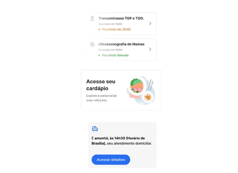
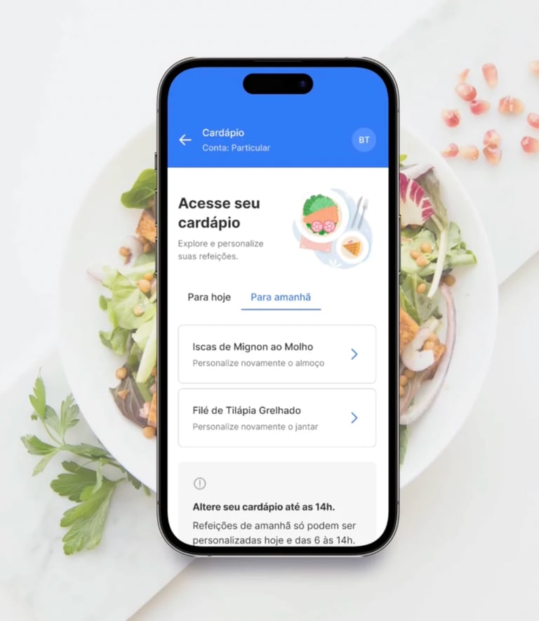
digital meal ordering for inpatients (selection and edits via the app);
remote care with better continuity across touchpoints;
exams and documents with secure, centralized access.
2022 | Consolidation
The app became the central digital touchpoint, reducing reliance on paper and in-person support for recurring tasks.
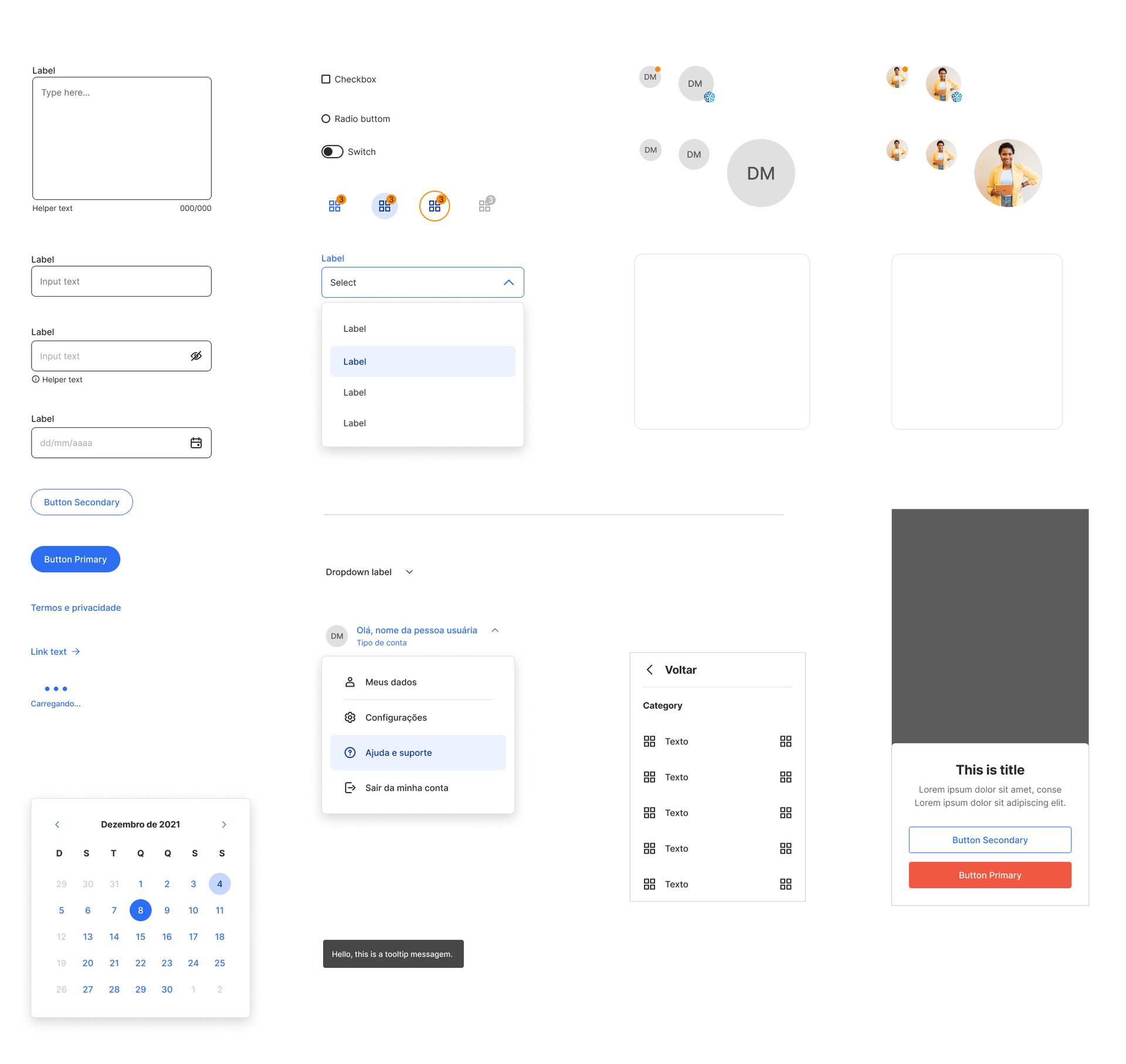
Design decisions
Predictability as a product feature (queue + check-in)
I pushed the experience toward clear statuses and next steps to reduce uncertainty:
explicit state messages (e.g., “started”, “waiting to be called”, “check-in completed”);
strong confirmations for critical actions;
guidance centered on what the patient should do now (not internal processes).
Journey-based information architecture (not org-based)
I advocated for navigation built around patient tasks, rather than internal hospital categories:
structure by journey moments (before/during/after);
plain-language labels and action-oriented microcopy;
fewer alternative paths to the same action to reduce confusion and errors.
Guardrails to reduce errors and rework
I prioritized UI decisions that lowered operational exceptions and support load:
in-context instructions and validation timing (not only at error state);
clear hierarchy and unambiguous CTAs;
consistent patterns across features so learnings transfer.
Trade-off: I recommended shipping fewer flows early, but with higher robustness in critical moments, rather than expanding scope quickly and creating inconsistency.
Outcomes
30% reduction in average waiting time at reception (before/after comparison linked to pre check-in and queue tracking).
10,000+ digital menus created/edited by patients and companions.
3,000+ appointments scheduled via the app.
1.5M exams available within the platform.
Results
Key learnings
In healthcare, predictability is part of care.
Scale happens when the product reduces friction for patients and reduces exceptions for operations.
Here's my resumé